Before & After: “The Water's Edge” Luxury Vacation Rental on Lake Conroe, Texas
Excited to share that we just completed our latest project: “The Water’s Edge”, a luxury vacation rental property on Lake Conroe, TX for Modern Stays Texas. This completely redesigned and fully renovated property brings a fresh and modern experience to guests visiting the lake. The property is perfectly situated in the Texas Triangle, an easy drive from the major metro areas and great get away for a long weekend!
We deliberately designed this luxury property to be both attractive and functional as a vacation rental, all while keeping the focus on the stunning lake front views!
Scroll through to see the side-by-side before and after shots of how we transformed this home. Transformation is our design superpower and this transformation is nothing short of amazing!
Vacation Rental Design & Renovation
Originally built in 1980, this 864 square foot, raised lakefront home was in need of a full renovation. New owners purchased this property as an investment at the end of 2023 with the intention to create a luxury short term rental property ready for booking Summer of 2024.
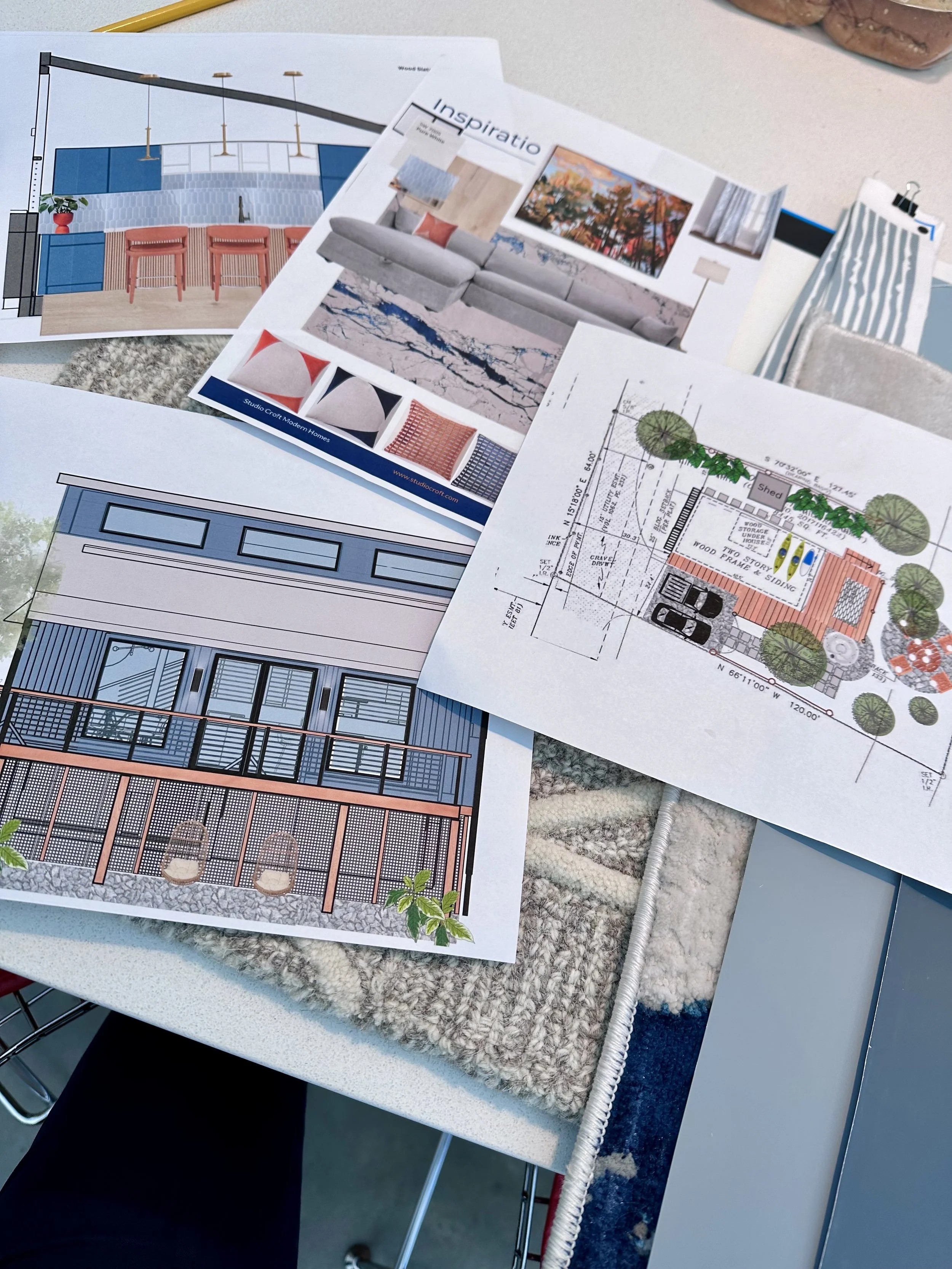
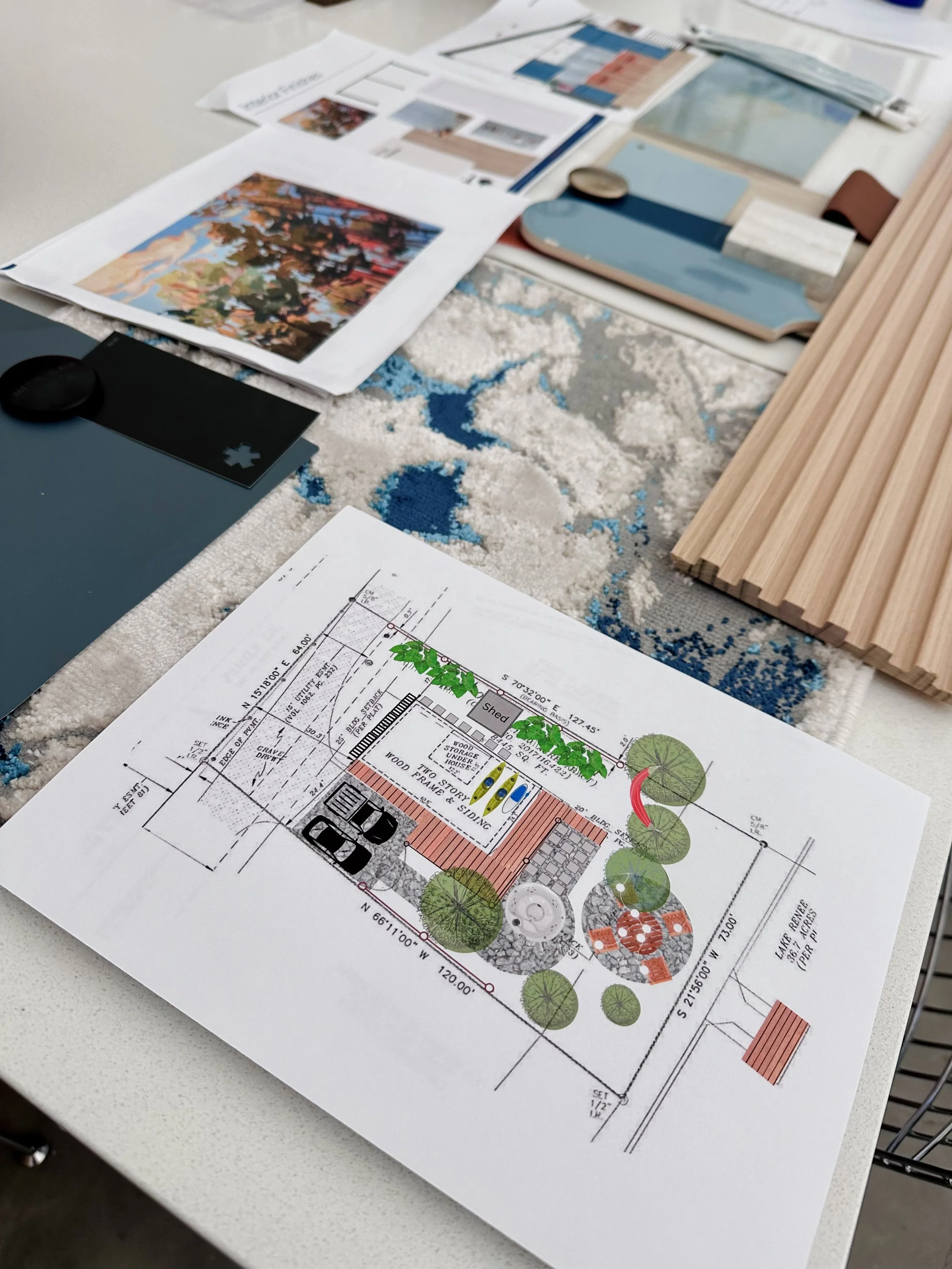
We were really able to flex our design muscles by taking this whole home renovation from concept-to-completion though our designer-led renovation process. It went from dated fish camp feel to fresh and modern lakefront vacation vibe. By crafting a full design master plan for this project before construction began, we were able to craft the vision for the design AND ensure that it was executed according to plan all the way through furniture and finishing touches.
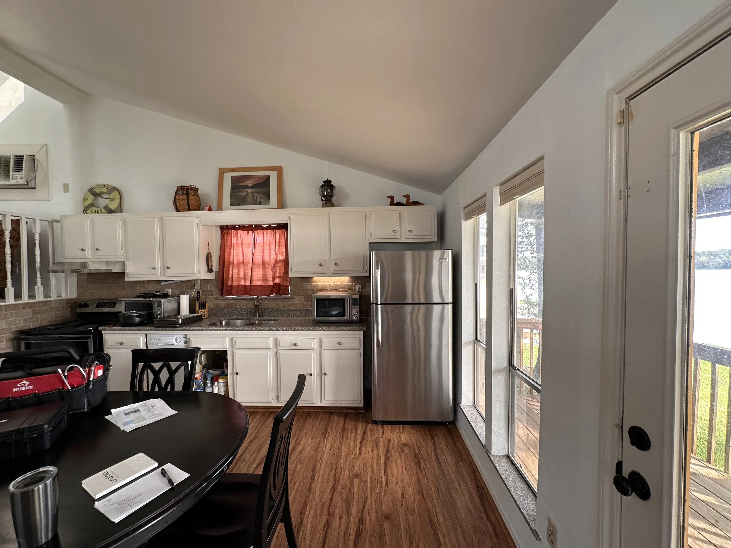
Challenges with this home included outdated plumbing and electrical systems, old windows and doors blocking the view and odd layouts for the kitchen and bath. Mismatched appliances and old cabinetry were in need of replacement. Inexpensive builder grade finishes and fixtures were deteriorating and adding to the shabby appearance.
See the @StudioCroft Instagram Highlight titled “Water’s Edge” for a BEFORE video walkthrough and project progress photos.
“This property is beautiful! The designer knocked it out of the park with all of the design choices… colorful and cohesive.
Love it so much!”
Kitchen Makeover
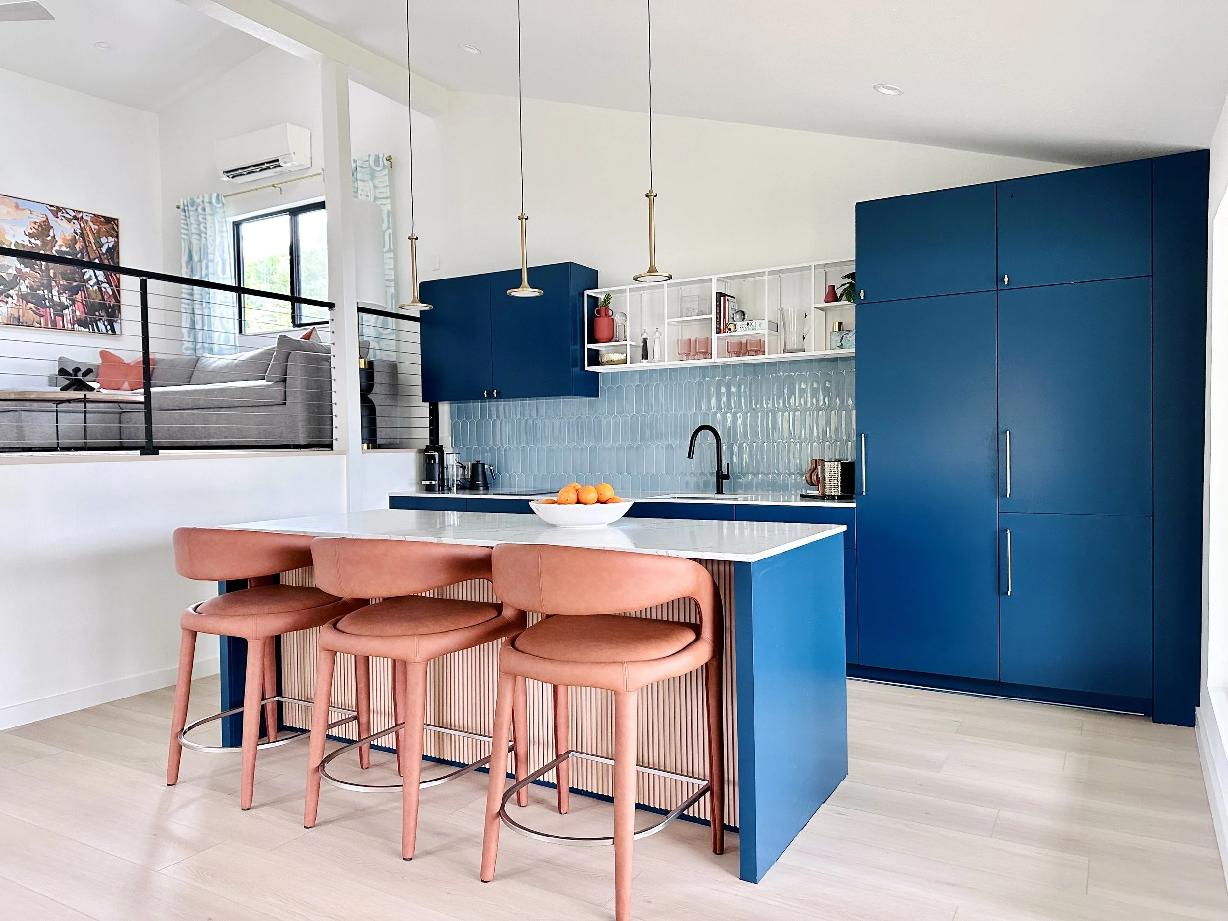
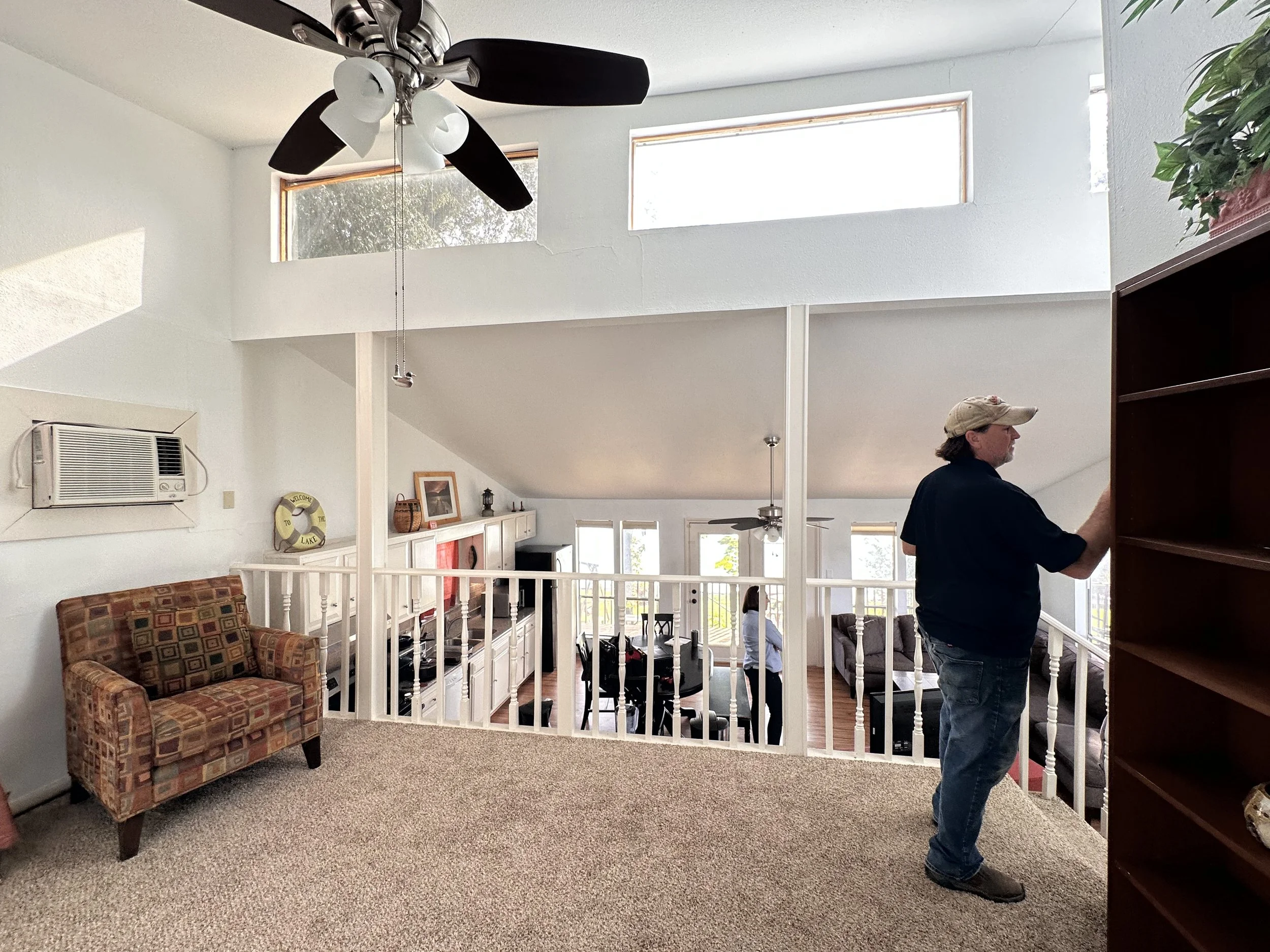
The original single wall kitchen was dated and the forty year old cabinets were falling apart. The layout out made for odd furiture placements throughout the whole home. Previous owners didn’t use the upstairs area for a living space, instead cramming all functions of living and dining to the lower area of the home. The painted wood spindles made both spaces feel smaller and isolated.
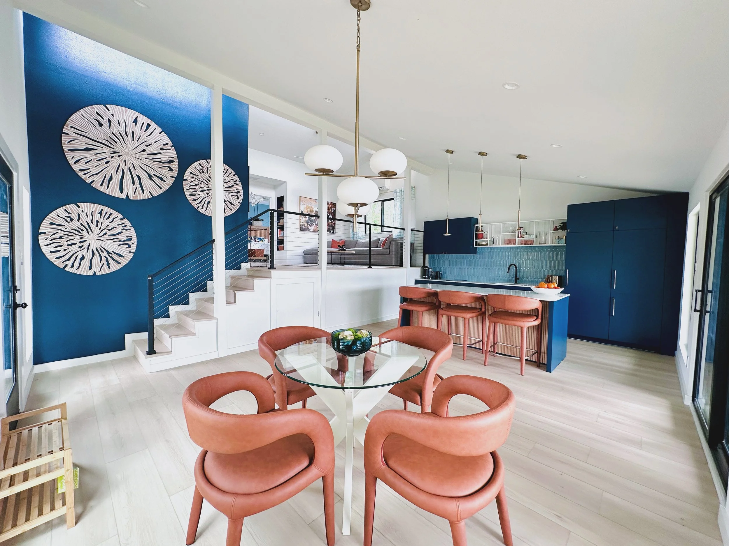
This home is small in square footage numbers, but with appropriately planned and scaled room layouts and impactful finish selections, we achieved a very spacious feeling. We relocated the main living seating area to the upper level and shifted the dining space to the other side of the lower level. This gave us space for that stunning, large kitchen island where guests love to gather.
Since the view out of the existing kitchen window looked right onto the neighbors property, we elected to close it off. This gave us design freedom to expand the back wall cabinet layout, add a statement backsplash and open shelving for storage which is easily accessible to guests.
The design elements that add to the WOW to this newly redesigned kitchen:
Open concept kitchen and dining area with dramatic lake views
Space saving luxury appliances including a combo column fridge and freezer with concealed water dispenser and ice maker, drawer dishwasher, and combo microwave and speed oven.
custom cabinetry with minimalist flat panel style in a statement deep blue
new kitchen island with white oak slats, luxury quartz countertop and extra seating
matte brass decorative pendant lighting
high end interior finishes that will stand up to the wear of vacation rental guests
Kitchen Before
Kitchen After
Dining Room Delivered
The dining area is one of the first things guests see when they enter the home. New larger windows focus on the lake views and bring in so much natural light. New finishes, new dimmable overhead lighting, a statement chandelier and new furnishings bring this space up-to-date. Colorful abstract artwork compliments the lake views!
Dining Area Before
Dining Area After. Photo: Ellen Renee Photos
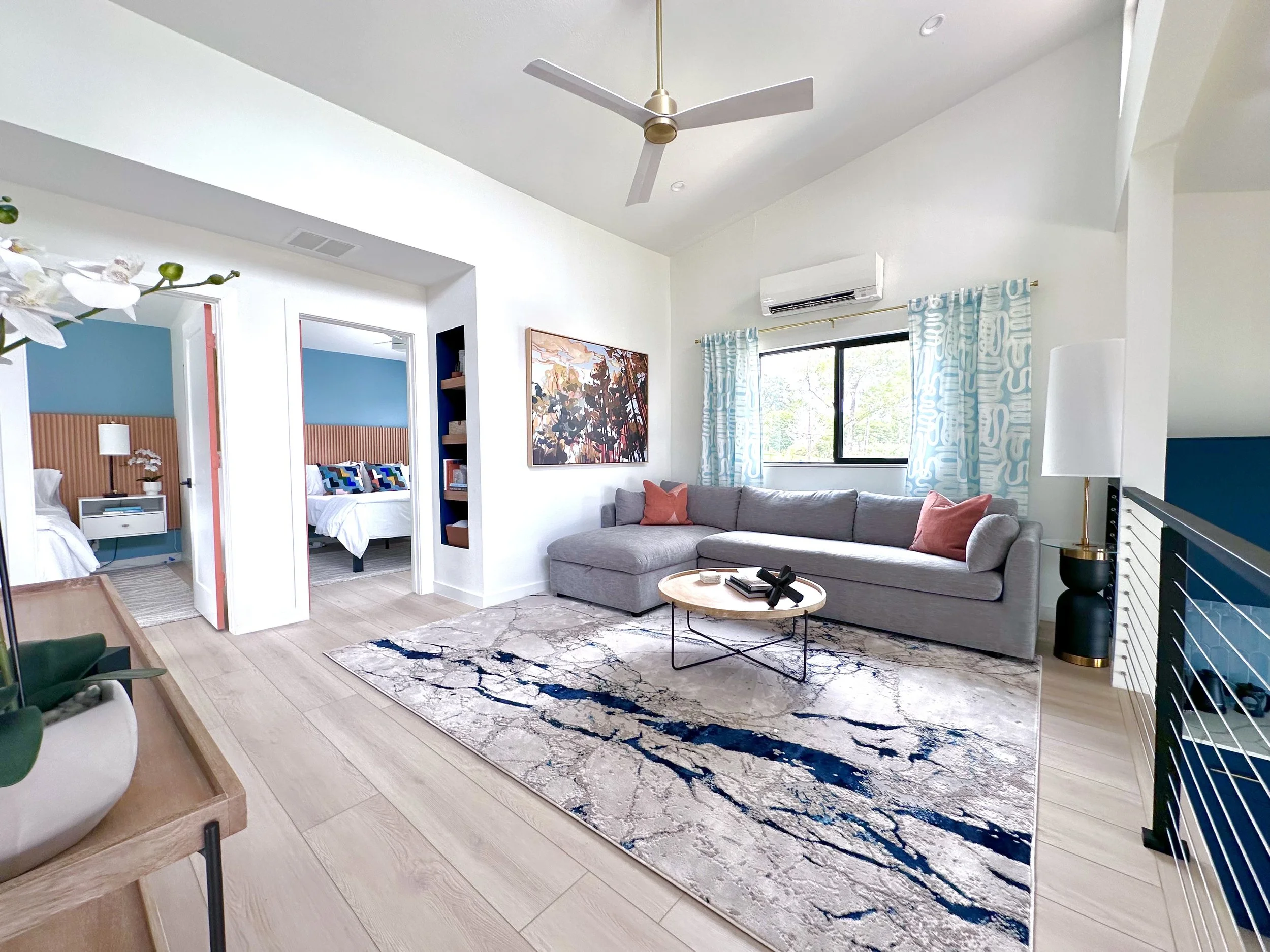
Living Room Redesign
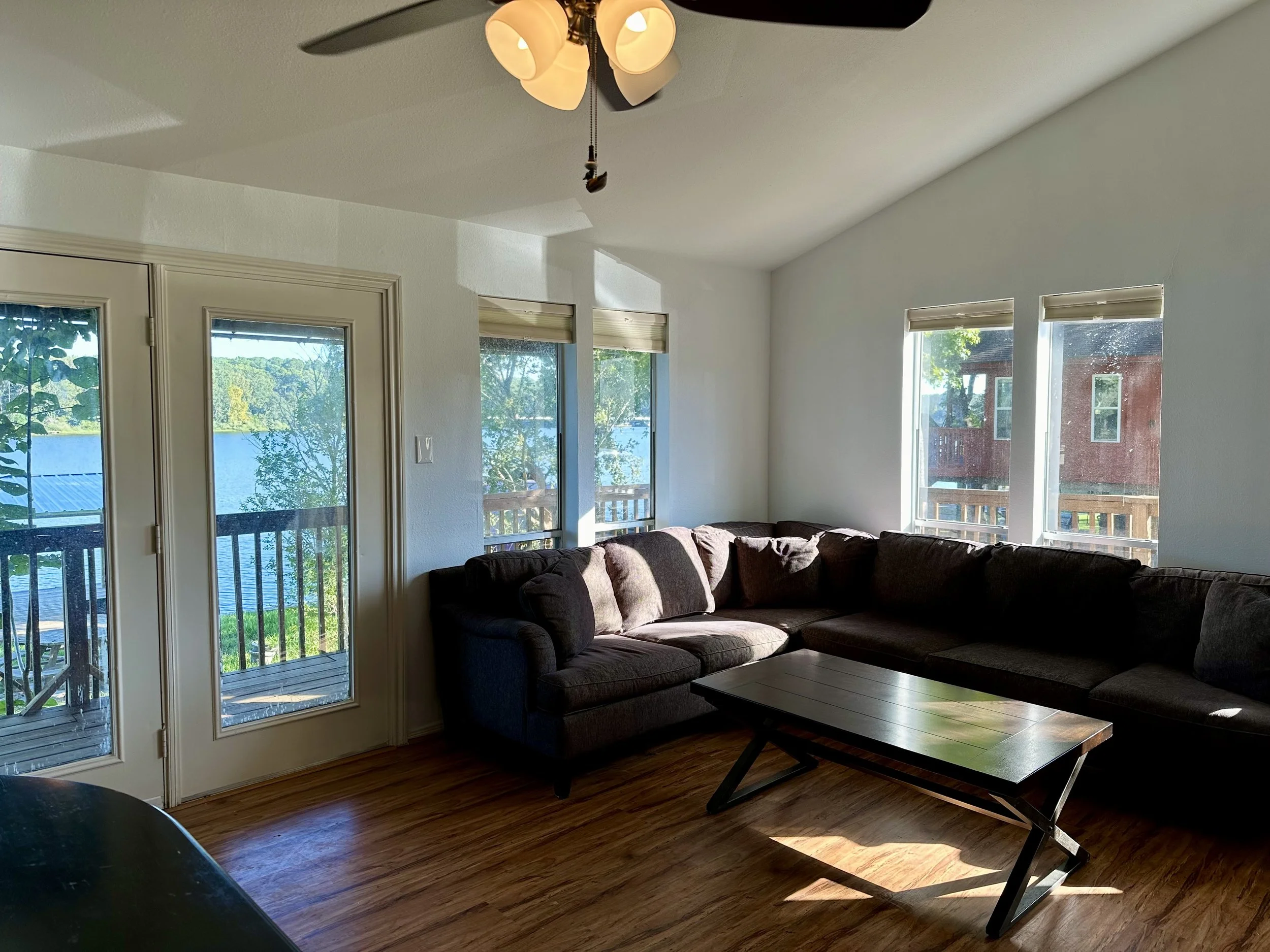
Previously, this small living area was filled with small, mismatch furniture and lacked a clear function. Our approach was to bring in larger scaled furniture that would span the whole room and make the most efficient use out of the available square footage. The goal was also to use finishes and furniture to unify the aesthetic of both the upper and lower spaces.
Living Before
Living After. Photo: Ellen Renee Photos
We incorporated a large modern style sectional with chaise and pull out queen sleeper. This allowed us to add extra sleeping accommodations and enough seating for the number of guests this home can host. This rental can now host two additional guest for increased occupancy. A storage closet was removed during framing to make the planned furniture arrangement work. We added a recessed wall niche with white oak floating shelves to store items guests may enjoy like games and books.
Minimal and streamlined occasional pieces accent the room, but keep the space feeling open and airy. The right furniture selections can be important to function and profit for vacation rental hosts.
Primary Bedroom
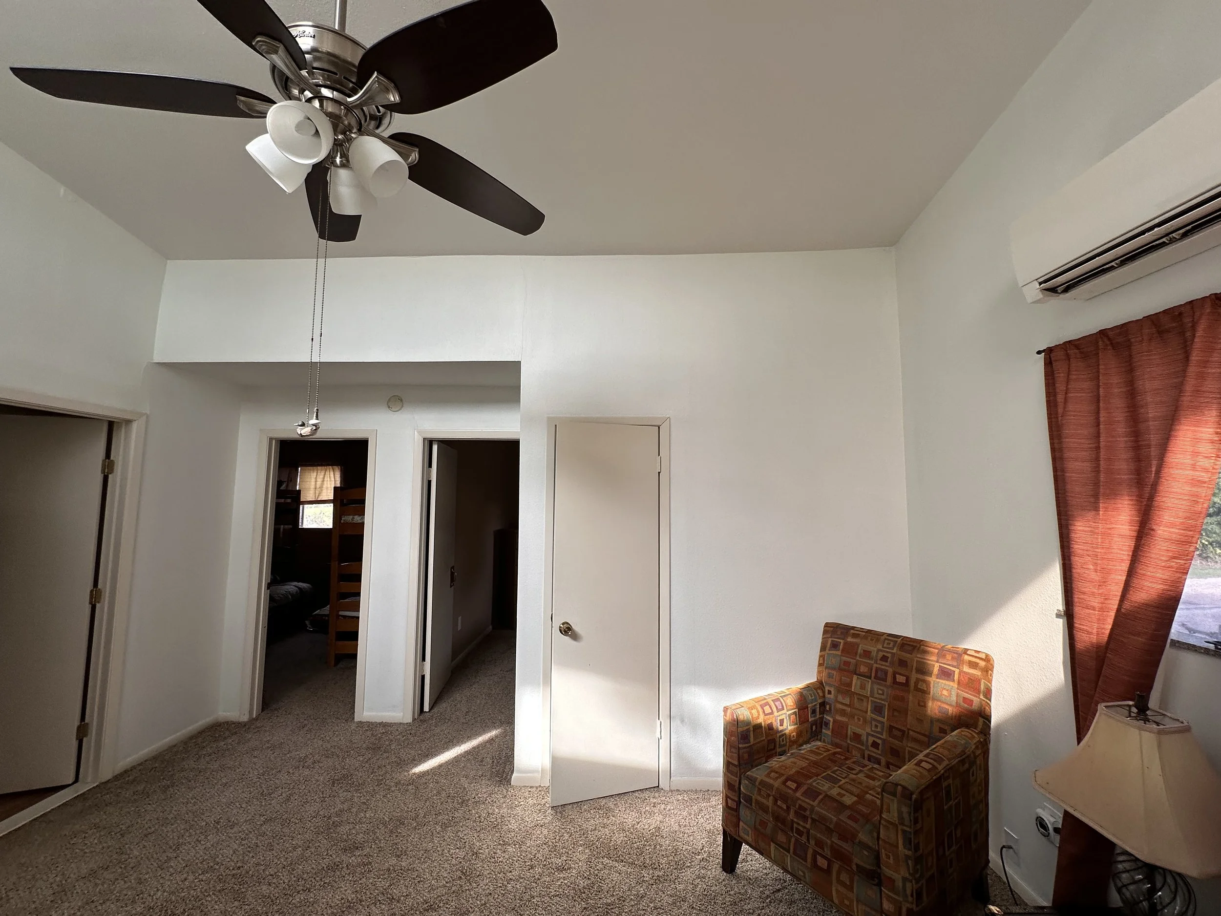
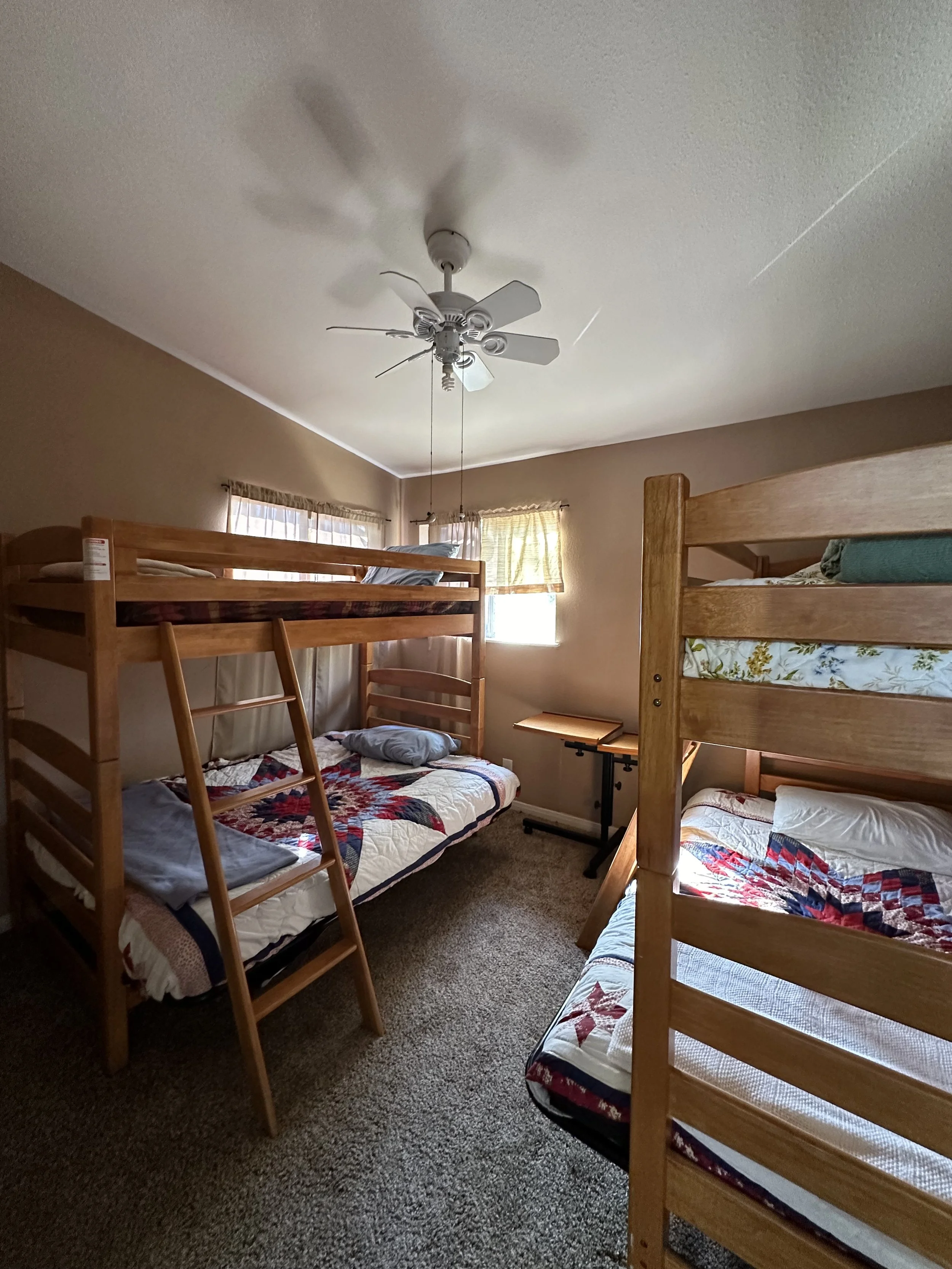
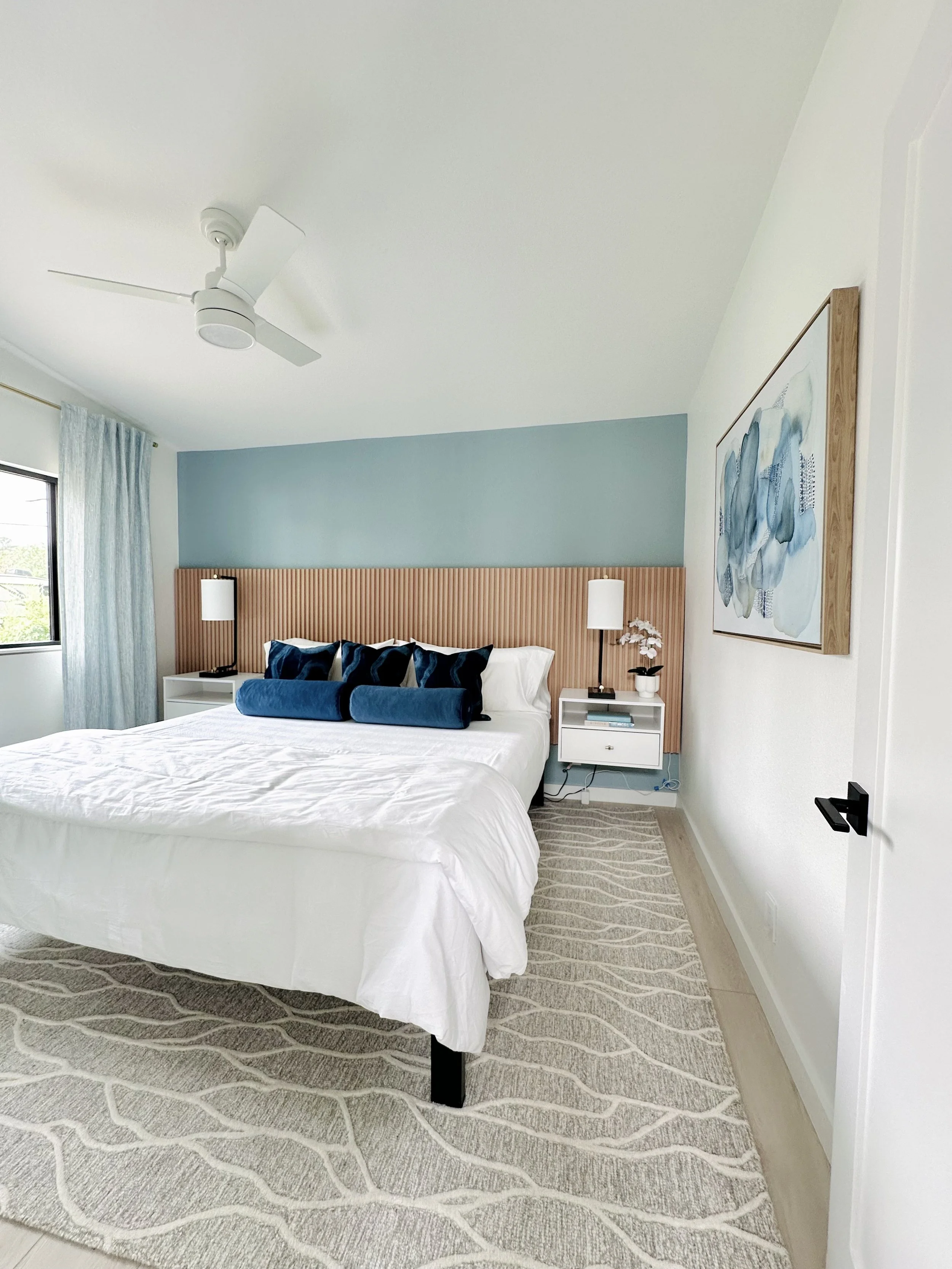
This is the larger of the two bedrooms. It previously held two bunk beds and felt very dark and crowded. Since it was the larger space, we recommended this as the primary bedroom. It was just the right size for that coveted vacation rental amenity- a king size bed!
In this new primary bedroom, we designed it to feel calm but still had so much fun with bold use of color, rich textures, refined modern materials, luxury linens and smart lighting!
Because we were involved before and durning construction we were able to work in important design changes during the framing stage. These changes had a huge impact on the overall outcome of the space. We opened up a wall and created a door directly into the bathroom. This space now has a bit of an en suite feel and some added privacy, especially if there are extra guests sleeping on the pull out sofa bed in the living room. By moving and enlarging the new bedroom window, we brought in more natural light. It also allowed us to add in some stunning custom printed drapery panels for light control. The drapery panels also draw the eye upwards in the room, amplifying the height of the sloped ceiling.
To further expand the feeling of the room. we designed a floating headboard to go wall-to-wall. Incorporating floating nightstands also kept the floor space open, both of which help the room feel larger and more cohesive.
Primary Bedroom Before
Primary Bedroom After
Secondary Bedroom
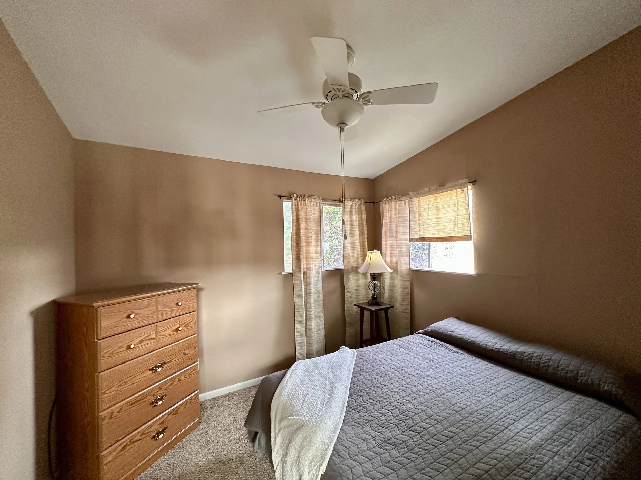
This was the smaller of the two side-by-side bedrooms. It was still adequate space to incorporate a queen size bed. Because the rooms are intended for couples, families or adult friend groups, we kept the bedroom designs very similar and refined just changing out artwork and accessories. We mirrored the changes to window location and furniture placement to keep the spaces very cohesive.
Secondary Bedroom Before
Secondary Bedroom After. Photo: Ellen Renee Photos
Bathroom Luxury
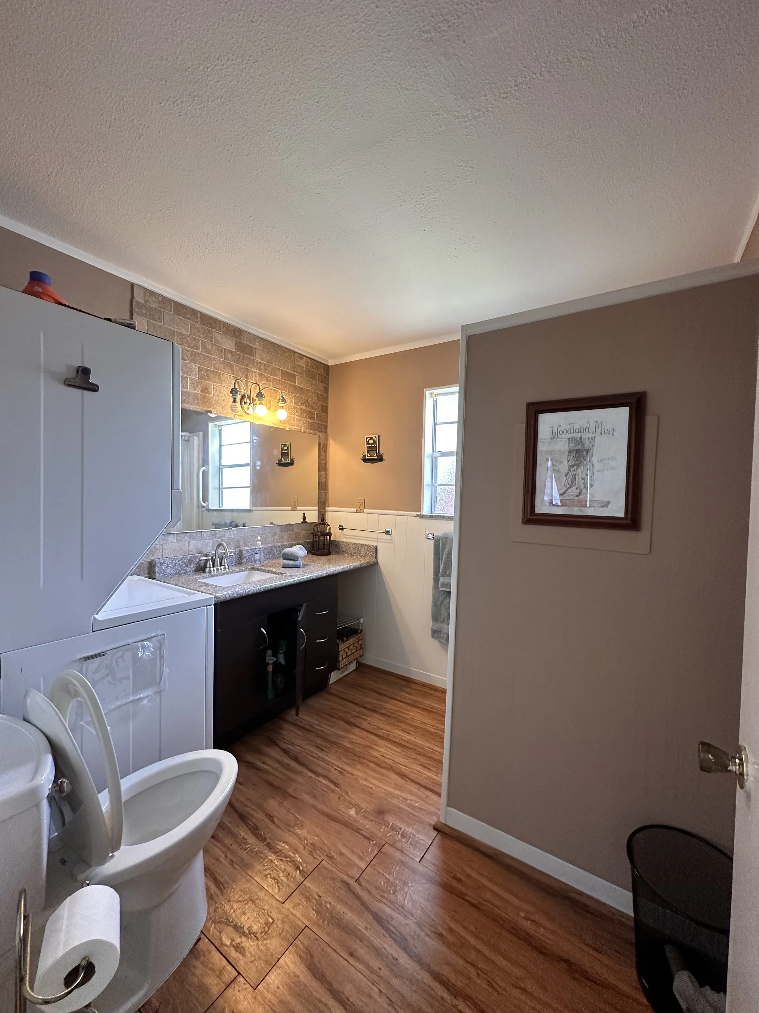
The new bathroom layout took this space from cramped to spacious. There is now a large shower (nearly double the size of the original) with a custom, modern, frameless shower glass enclosure and a double vanity. The design showcases sophisticated brass accents and soothing large format, aqua accent shower tiles. Upgraded finishes and fixtures, make this the perfect relaxing retreat.
Bathroom Before
Bathroom After
“Beautifully designed retreat. Stayed 2 nights and love the artwork, the modern kitchen with backsplash that mimics waves on the water, and the beautiful bath tile that I wish was in my home. Lake views throughout. Modern style with lots of comfort! ”
Exterior Upgrade
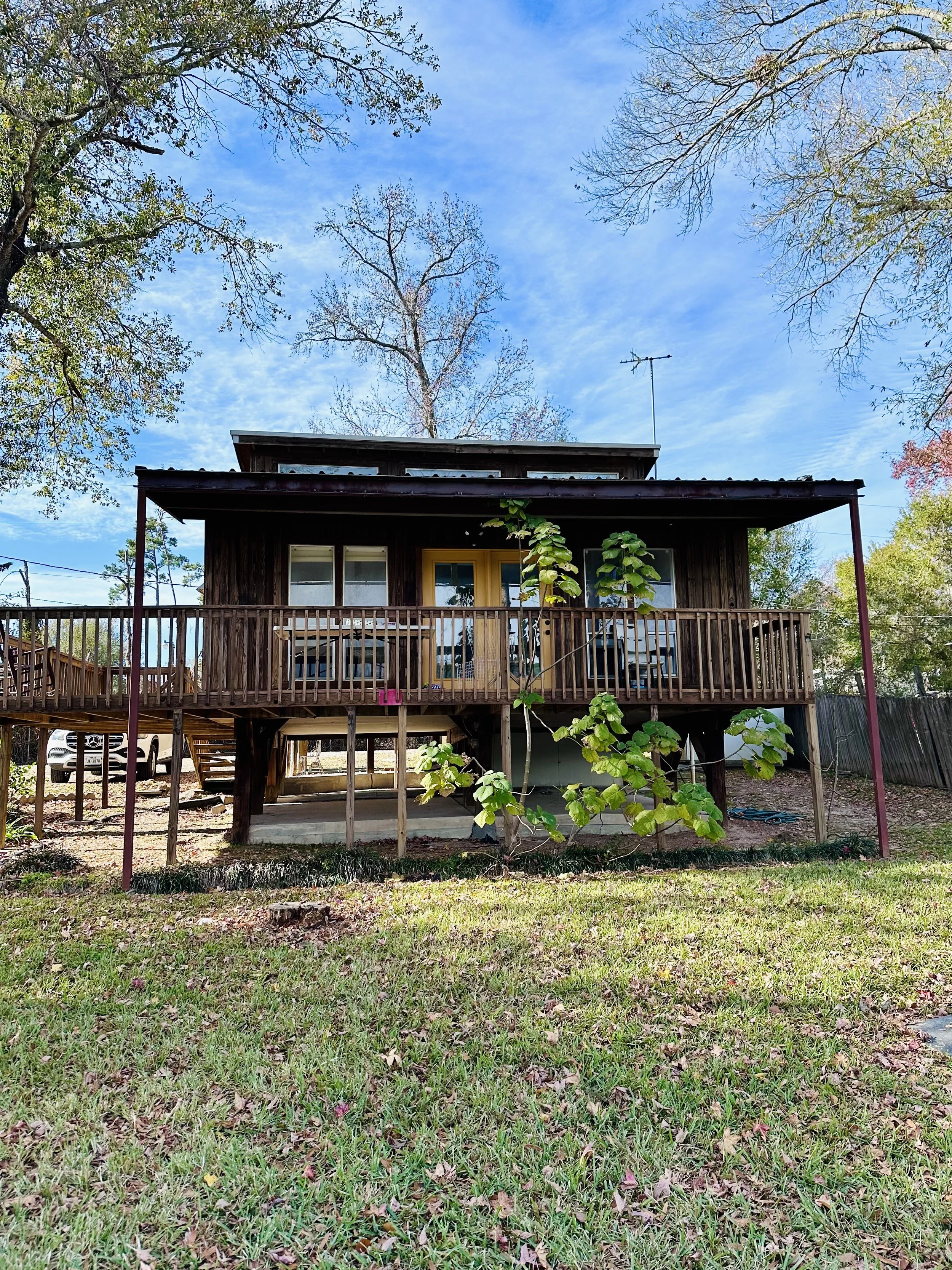
From the start, this raised home had the architectural interest needed for an intriguing vacation property. It just needed some polish. Our vision took the first impression of this home from dark and dated to modern and inviting. A fresh paint scheme compliments the modern silhouette of this home. New, larger windows with black aluminum frames updated the facade. The expanded deck with new slat wall privacy screens create more intimate outdoor spaces for connecting with friends, family and loved ones.
Exterior & Deck Before
Exterior & Deck After
Deck Expansion
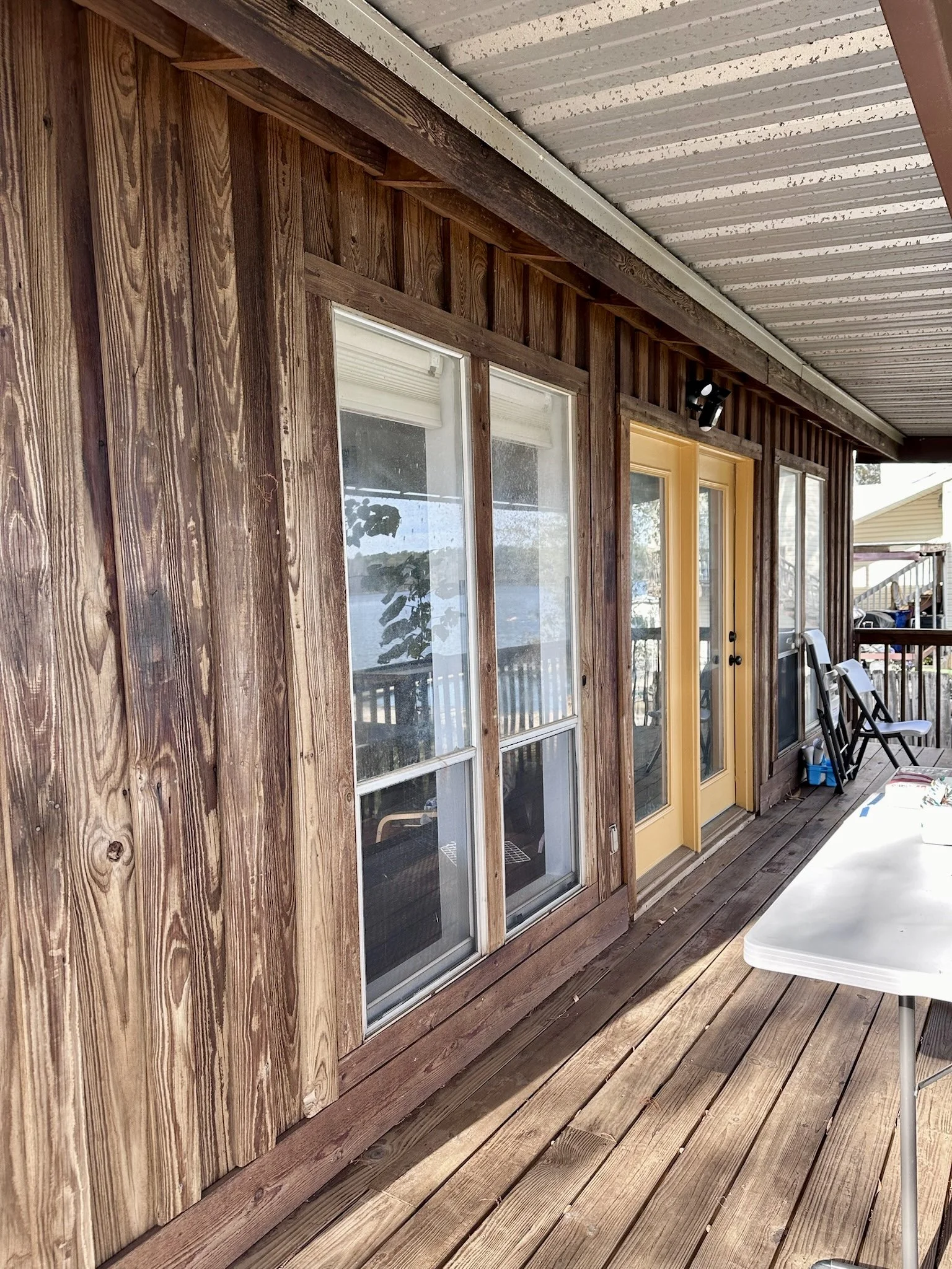
The original deck was shallow and though covered, it did not leave much room for relaxing. Structurally, the deck was in poor condition and required a complete rebuild. We designed the new back deck expansion with multiple areas for taking in the 180 degree lake views. New metal railings with cable infill add to the minimalist aesthetic and help to preserve the views.
To appeal to potential guests, we added a suspended lounge net. This gives the property an attractive and unique feature to stand out from the local competition. This lounge net is a large, outdoor, marine grade net that has been tensioned to create a place for lounging and relaxing. It serves a similar purpose to a hammock, but does not swing. The company that made this architectural net also makes strong and durable nets for catamarans.
We positioned this special feature to have the best lake view and take advantage of the lake breeze! It’s an awesome place for conversation, relaxation and maybe a nap or two!
Back Deck Before
Expanded Back Deck After. Photo: Ellen Renee Photos
With the goals of increasing the rental occupancy rate and to generate income for the property owners, we created a space that is is truly unqiue in the Lake Conroe Vacation Rental market. It’s not kitschy and not country. It is all modern with the luxury guest experience and stunning lake views front and center.
Ready to elevate your own home or luxury vacation rental property?
Book a discovery call and start your journey to a beautifully curated space!
